


Mobile phone usage has been on a continual rise over the years. People in general have been ditching the home landline, with every occupant in the home having at least a basic cell phone or tablet to stay connected. In fact, in 2020, 79% of American users reported owning a smartphone. And it’s important to note more than 50% of all world-wide Internet searches (through search engines like Google) are done on mobile devices. Google also prioritizes mobile page load speed when determining your website’s search ranking. Whether your business is large or small, it just makes sense to have a responsive website regardless of industry.
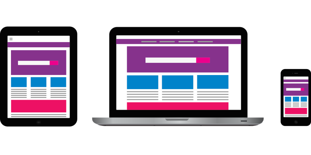
What is a responsive website?
A responsive website is a website design that allows the website to adapt to any screen size on which it is being used. Some website providers tout “mobile-friendly” websites which look good on a smartphone but not a tablet or desktop computer. They can have glitches and be pixelated when viewed on devices with a higher resolution such as a smart TV.
Structure and functionality matter
Regardless of how the visitor has navigated to your site, the user experience should be straightforward and easy from device to device. Content must be easily accessible by scrolling up and down without pinching or scrolling left and right.
Here are 6 essential tips for optimizing a responsive website:
- Keep the most important aspects at visitors’ fingertips: Make it effortless for users to contact you. Your logo, main contact points (phone number, address, social media links, contact form button), navigation/menu, and search feature (if it’s a large or ecommerce site) should all be easy to find. If your website has a lot of content or just gets visually lengthy, a “back-to-top” button is recommended. This is typically a sticky arrow button that appears when the visitor scrolls past a certain point on your site.
- Ditch the clunky navigation/menu: On mobile, it is typical to see the menu collapsed into what is referred to as a “hamburger menu” (three horizontal lines) in the upper left- or right-hand corner of the site. The menu list should be as short and concise as possible. You can have items accordion below the main navigation items that open and collapse as they are clicked through.
-
 Use large buttons and text: The buttons should be easy to see/read and clickable for making purchases or taking other actions on the website. Make buttons big enough for people to tap them on a smaller screen size. Also, ensure the website text/font size is large enough to read without users needing to zoom in.
- Understand content stacking (text and images): Keep in mind how the content presentation changes between desktop, tablet, and smartphone. Going from a full-width, multi-column desktop layout to a mobile website means the content elements should simply stack vertically as the window width becomes smaller. This should be thoughtfully considered in the content development stage.
- Vary the call-to-action: It’s important to vary the call-to-action (CTA) phrases throughout the site as this helps boost SEO, conversions, and overall sales. The site should not be overly peppered with common CTAs like “Learn More” or “Get Started.” Think about the goals of your site, the flow of the user experience, and how your CTA will get the click. More unique examples include: “Let’s Start a New Project Together,” “Join Free for a Month,” “Send Me Specials Now,” and “Take Me There.” CTAs should be a button or larger content element and strategically placed for high visibility.
- Optimize file sizes and fillable forms: To keep the website loading quickly, the file sizes need to be as small as possible and backed by an appropriately sized hosting package for optimal performance. Even forms for employment should be simple and quick to fill out on the small screen of a mobile device. Don’t make them scroll forever.
So, is your current business website responsive? Are you following SEO best practices? Not sure? We want you to show up in searches! Get a free SEO analysis here: https://baerpm.com/ Click the “Analyze my website” button.


