Some brands have undergone many changes over the years. Others have hit the nail on the head the first time. In marketing your brand, whether B2C or B2B, it is important to constantly review your target market and reinvent the business as needed to stay relevant, fresh, and ever changing with the times.
One of the best ways to embrace change is to undergo a logo redesign. This can be a complete overhaul or just subtle changes to the current logo design, such as a new logo mark, font, or selection of color.
Some businesses inherently have an easier time standing out in their respective industry. Their market is flooded with poorly-designed logos, making the leap into a new logo design have more of a wow factor. There are some brands, however, that require constant revaluation to remain ahead of the curve. Here are a few samples of various changes that Pepsi and Taco Bell have made to their logos over the years.
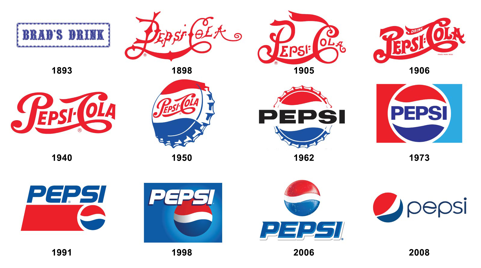
Pepsi brand evolution: 1893 to present day

Taco Bell’s logo capsules: 1962 to present day
How do you determine if your brand requires a redesign? Here are 7 key questions to ask about your business’ logo:
- What does our current logo mean/represent?
- How does our current logo make customers feel?
- Is our current logo visible/recognizable, regardless of size?
- Is our current logo timeless? Where do we see our brand in 10 years?
- What are the key points about our business the logo should convey?
- Which colors and fonts best suit our brand?
- Who is our target audience?
Here are some recent redesigns and branding projects from the graphic design desks at Baer.
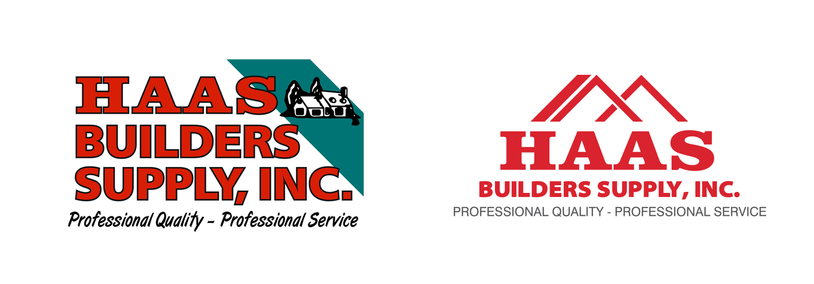
Haas Builders Supply, Inc. before and after redesign
Haas Builders Supply, Inc. reached out to Baer Performance Marketing to design a new website. The team at Baer suggested a logo redesign before tackling the new website project. The new Haas logo references the previous logo by utilizing the same main font but is a more modern, simple take on design. With a newly defined mark, the logo becomes more usable in its entirety. The mark can also be a standalone icon for use on social media or a background design element on various marketing collateral.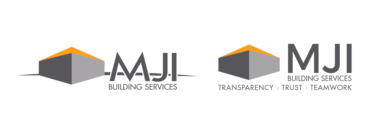
MJI Building Services before and after redesign
The building professionals at MJI Building Services contacted Baer for a few different marketing pieces, including a logo facelift with tagline creation. The redesigned logo has been cleaned up with the removal of the horizontal horizon line, making the logo much easier to reproduce on marketing materials (especially embroidery of business apparel). New font choices were selected, and the strategically-crafted tagline was added.
Elevé MedSpa logo development
Surgical Associates, S.C. is in the process of opening a new med spa clinic, “Elevé MedSpa.” They asked the creative minds at Baer to create a logo that represents the meaning behind the Elevé brand and is geared toward women (their main client base for this new practice). The word Elevé translates to “high.” They chose this because they want the brand to be projected as a high-end med spa which boasts numerous cosmetic and plastic surgery procedures. The Elevé MedSpa mark is an “E” and a subtle representation of an arrow or peak.
In all of these logo design cases, Baer also created and provided the client with a brand standards/guide document that lays out the logo’s colors, fonts, and file formats. A brand standards/guide is a document that’s easy for businesses to share with their partners and vendors to ensure the organization’s logo is used consistently across all print and web channels.
Important takeaways:
As you examine your own brand identity, it is important to have an open mind and be willing to have others critique the way your logo represents your brand and business. Whether it is being used on a brochure, website, or sponsorship banner, you want a consistent message portrayed across all media.
Ready to redesign your logo? The Baer Performance Marketing team is ready to help you establish a new logo and brand standards/guide. Message us today to get started.


